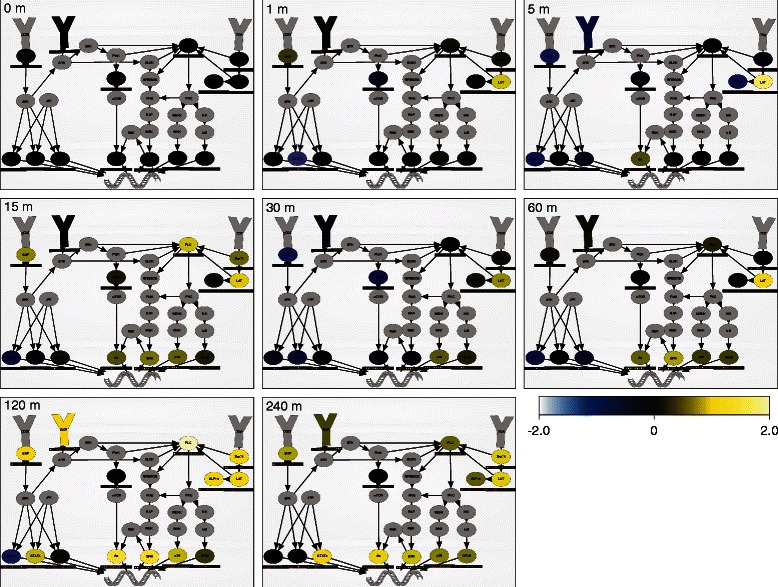
Figure 2.

NetworkPainter visualizes multi-parameter data in the context of biological pathways. PBMC pathway painted with a time course of mass cytometry measurements obtained at 0, 1, 5, 15, 30, 60, 120, and 240 min post-LPS induction [10]. Animated pathway diagram highlights the differential cell type responses observed by Bodenmiller et al. Heatmaps indicate each node's median activity across the fourteen observed cell types (first row: CD14- monocytes; second row: CD14+ monocytes; third row: dendritic cells, IgM+ B cells, IgM- B cells, NK cells; last row: CD8+ T cells, CD4+ T cells). Nodes are colored by their mean value across all fourteen cell types. Yellow color indicates high activity; blue indicates low activity. An interactive, animated version of Figure 2 is available at http://covert.stanford.edu/networkpainter/KarrEtAl2014Fig2.
