
Figure 1.
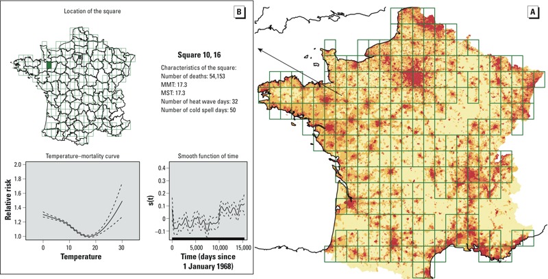
(A) Grid placed over continental France to obtain the squares used in the analysis. The pixel color indicates the population density in 2008 (red: highest; pale yellow: lowest). The temperature–mortality analysis (shown in (B) for a particular square in the western part of France) was done for each of the squares with > 1.5 deaths/day during each of the studied periods, corresponding to 22,500 deaths in the total analysis (228 squares), and to 7,500 deaths/period for the by-period analyses (224 squares). For each grid square, a GAM was used to model the temperature–mortality relationship and extract the corresponding curve and three parameters: the minimum mortality temperature (MMT) and the relative risk of mortality expressed as the ratios of mortality observed at 25°C to that observed at MMT (RM25) or that observed at 18°C (RM25/18). This map is interactive at http://www.isis-diab.org/isispub/ehp/interactive_map_wp.htm. (B) Clicking on any square of the map shows vital information on the square (top), the smooth function of time [s(t) (defined in Equation 1) bottom right], and the variation with temperature of the relative risk of total mortality for individuals > 65 years old [the reference risk was the mortality observed at the MMT of each square: here (bottom left) is thus plotted s1(T)/s1(MMT)]. One example is shown here: The detailed information pertaining to the 1968–2009 period for all squares of the grid is obtained on the interactive map where the temperature–mortality curves can be viewed for the all the study periods [Pall (1968-2009), P1 (1968–1981), P2 (1982–1995), and P3 (1996–2009)].