
Figure 2.
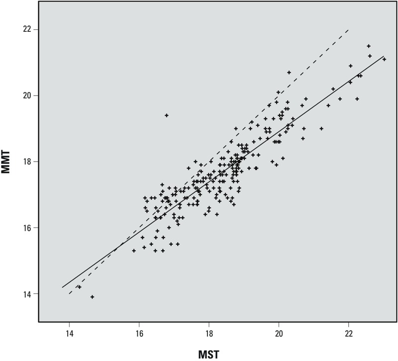
Geographic variations of MMT versus MST in France. Each point represents the MMT and MST values in one of the 228 grid squares shown in Figure 1, during the study period 1968–2009. The squares analyzed are those with > 22,500 deaths during the study period (~ 1.5 deaths/day). Solid line: regression line. Dotted line: MMT = MST.