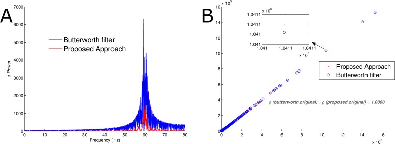
Figure 5. Comparison of power spectra.
(A) The red trace represents the Manhattan distance between the Fourier transformation of the proposed reconstruction procedure and the original signal without artificial noise. Similarly, the blue trace is the Manhattan distance between the Fourier transformation of the signal obtained via band-stop Butterworth filtering and the original signal without artificial noise. (B) The red trace is a scatterplot of the Fourier transform of the original signal and the reconstructed signal using the proposed approach. Likewise, the blue trace represents a scatterplot of the Fourier transform of the original signal and the reconstructed signal using a band-stop Butterworth filter. Pearson’s correlation coefficient for both were 1.0000.

