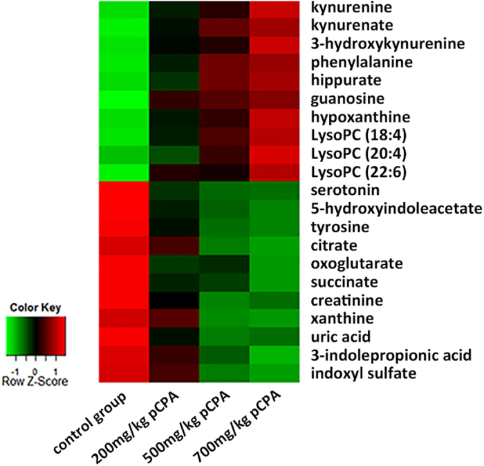
Figure 3. Heat map denoting fold changes (over normalized means) of the 21 biomarkers in mice injected with increasing dosages of pCPA and the control mice (n = 10).

Columns correspond to different mice groups, and rows correspond to the altered metabolites. Shades of red represent elevated levels of metabolite, and shades of green represent reduced levels of the metabolites.
