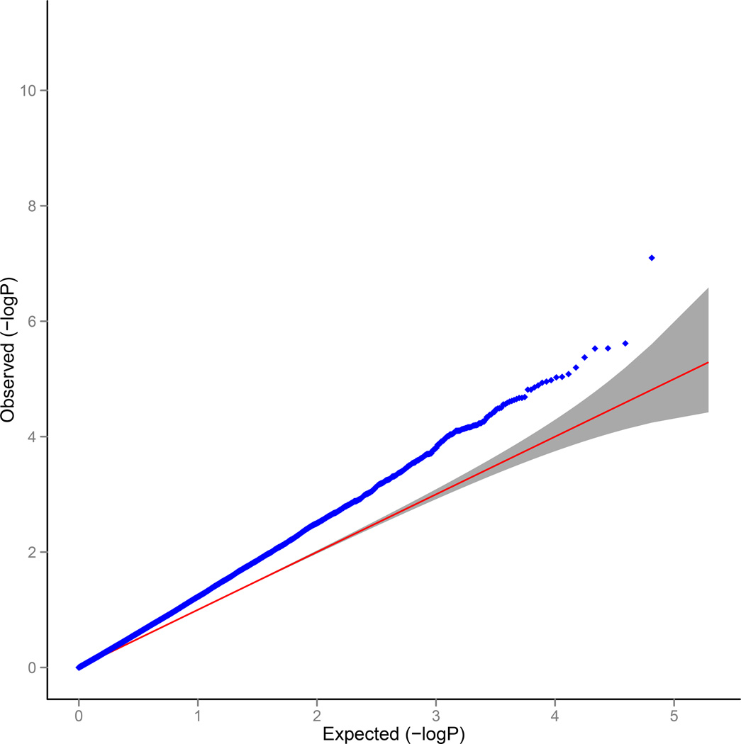
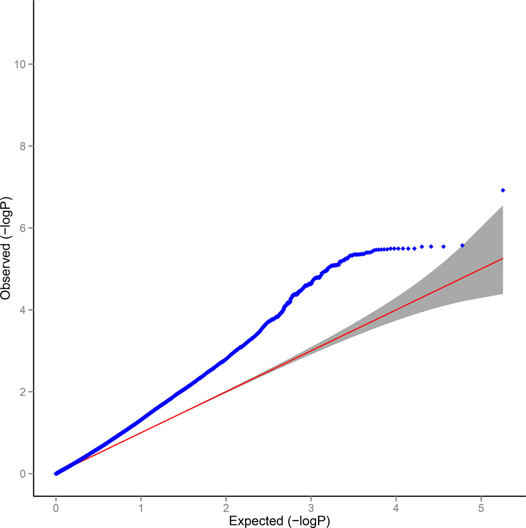
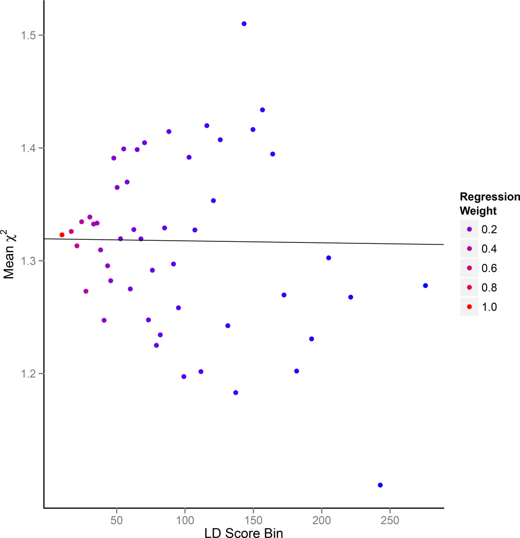
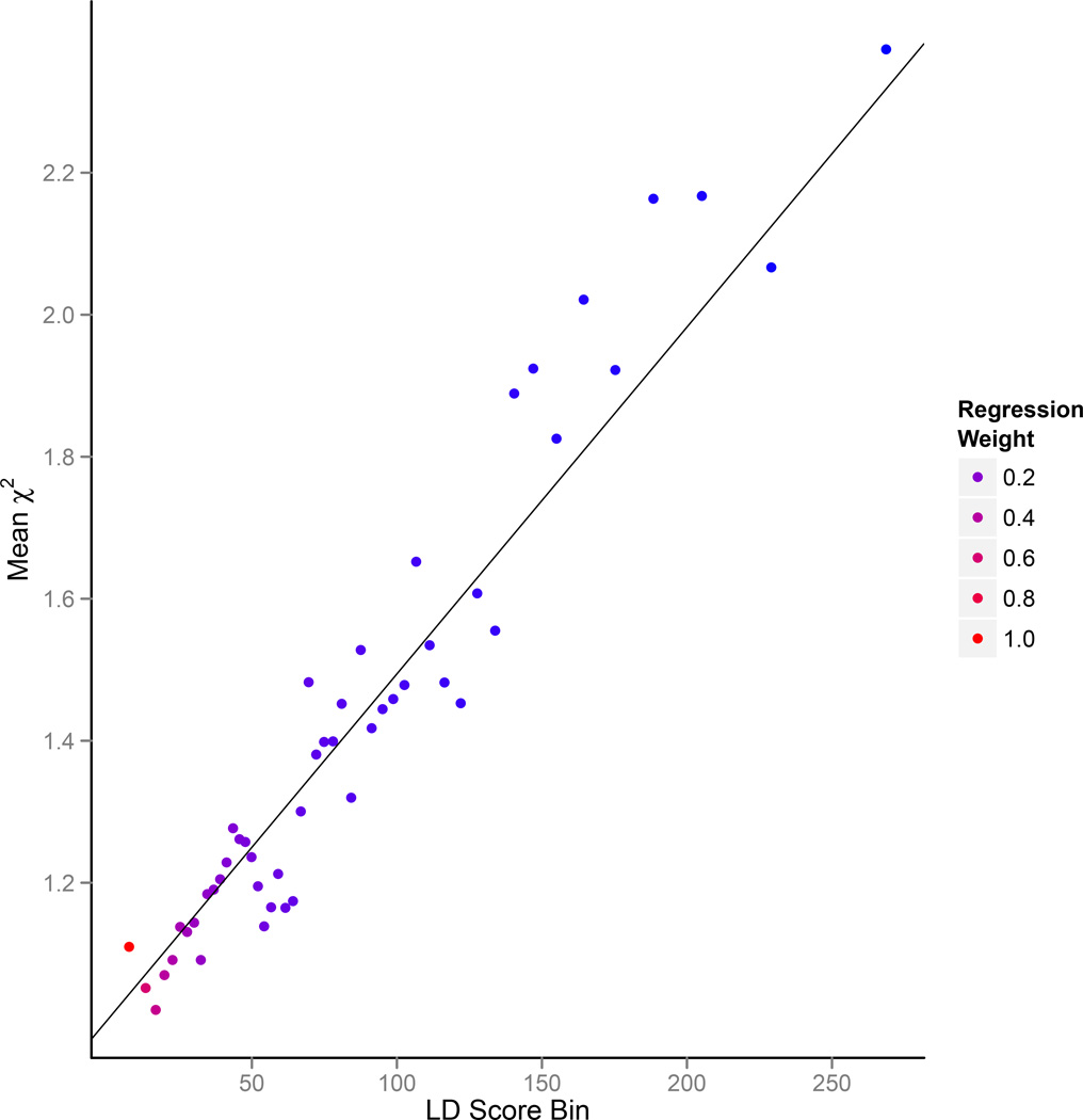
Figure 1.
Results from selected simulations. (a) QQ plot with population stratification (λGC = 1.32, LD Score regression intercept = 1.30). (b) QQ plot with polygenic genetic architecture with 0.1% of SNPs causal (λGC = 1.32, LD Score regression intercept = 1.006) (c) LD Score plot with population stratification. Each point represents an LD Score quantile, where the x-coordinate of the point is the mean LD Score of variants in that quantile and the y-coordinate is the mean χ2 of variants in that quantile. Colors correspond to regression weights, with red indicating large weight. The black line is the LD Score regression line. (d) As in panel c but LD Score plot with polygenic genetic architecture.


