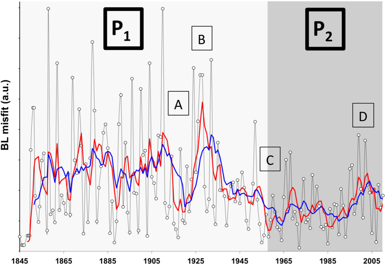
Figure 5. Calculation of misfit from BL estimate over the entire TC dataset.
The scatter of the data is on itself an indication of the dataset quality and homogeneity. The graphic represent the evaluation of the BL Misfit per individual years (black with empty circles), 5YRM (red) and 10YRM (blue). P1 and P2 divide the dataset into two large periods relating to technological improvements. A, B, C and D correspond notable shifts or fluctuations within the BL misfit.

