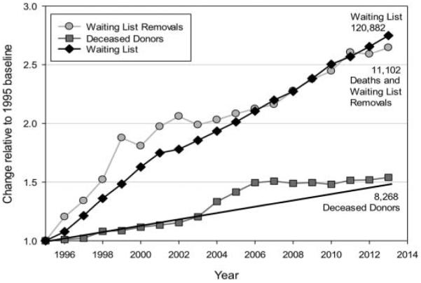
Figure 1.

Relative change in transplant data. This graph depicts the change in deceased donors, all-organ waiting list, and deaths plus waiting list removals (virtually all are patients who became too sick to transplant and died off the list) relative to the 1995 baseline. The sharp rise in deceased donors in 2003–2006 reflects the results of intensive efforts to increase donation by the Organ Donation Breakthrough Collaborative (HRSA 2014b). The trend line shows that after the Collaborative ended, donation plateaued, placing the 2013 donation rate where it would have been if the collaborative had not occurred (source of data: HRSA 2014a).
