. 2015 Jun 17;4:e07290. doi: 10.7554/eLife.07290

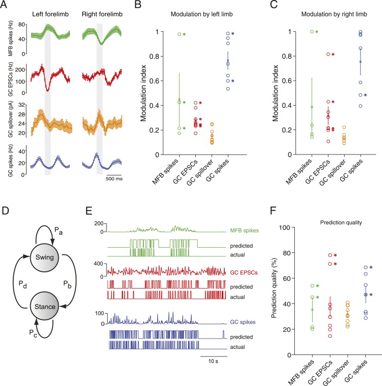
Figure 4. Decoding activity in a single granule cell can predict the step cycle.

(A) Example step-triggered averages of activity for three different cells (EPSC and spillover examples are from the same granule cell). Gray-shaded area indicates the swing phase of the step cycle. (B, C) Step cycle modulation index for each forelimb across all cells. (D) Two state Hidden Markov Model (HMM) used to reconstruct the step cycle from electrophysiological recordings. (E) Example of successful step reconstructions for an MFB (red), GC EPSC recording (green) and GC spikes (blue). The top traces represent the electrophysiological event rate in Hz, the middle traces the step transition (with the high state being the swing phase and the low state being the stance) predicted by the HMM, and the lower trace being the actual step of the best modulated limb. (F) Prediction quality for all cells.

DOI: http://dx.doi.org/10.7554/eLife.07290.008

Figure 4.

Figure 4—figure supplement 1. Spillover acts like a temporal filter.

Figure 4—figure supplement 1.

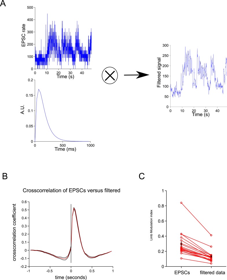
(A) We convolved the ESPCs rates with a biexponential trace to give a filtered trace. (B) The cross-correlation between the filtered traced and EPSCs resembles the cross-correlation between spillover and EPSCs (Figure 2C). (C) The step cycle modulation of the EPSCs is drastically reduced by the filtering procedure (from 0.30 ± 0.03 to 0.13 ± 0.2; p = 4.65 × 10⁻⁴; n = 18, 2 limbs for n = 9 cells).
Figure 4—figure supplement 2. Tuning of responses to the step cycle.

Figure 4—figure supplement 2.

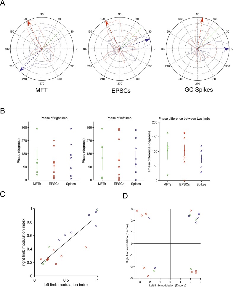
(A) Polar plot representing the step cycle modulation for each of the forelimb. Each of these plots is a representation of the step cycle for one recording (respectively an MFT, EPSC and GC spike recording), 0° being the start of the swing phase, the green line is end of the swing phase. Each trace (blue: left forelimb, red: right forelimb) represents as the radius in the plot the modulation of activity (see ‘Materials and methods’) for that phase of the step cycle (for the MFT plot, the scale corresponds to 2.4 Hz for the blue trace and 2.7 Hz for the red trace, for the EPSC plot the scale is 120 Hz for the blue trace and 65 Hz for the red trace, and for the GC spike trace, the scale is 13.6 Hz for the blue trace and 9.4 Hz for the red trace). The arrows show the phase of maximal modulation. Note that for these recordings, the maximal modulations are at roughly 90°. (B) The phases at which maximal modulation occurs can vary widely across cells for both the left and right forelimb (left and middle trace). The phase difference between these modulations for each cell is shown in the right panel. (C) The magnitude of modulation is highly correlated for the right and left limb across recording modalities (green: MFTS, red: EPSCs, blue: GC spikes). (D) The direction of maximum modulation is plotted here for all cells as a z-value (i.e., negative values indicate a decrease in activity and positive values an increase) for both the left and right forelimb.