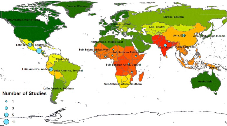
Fig. 2.

The location of included studies. Countries are grouped as per the Global Burden of Disease regions and colour coordinated in terms of burden of disease attributable to HAP from solid fuels. The numbers of studies in each region are illustrated by the size of the circular marker. High to low burden of disease attributable to HAP from solid fuels as per Lim et. al. [5] is represented by  signifying highest levels of disease burden to
  signifying lowest levels of disease burden. This figure was created by the authors using ArcInfo 10.2.1
