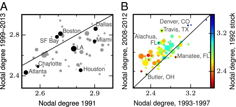
Fig. 6.
Persistence of sprawl. (A) Nodal degree of new development, 1999–2013, against nodal degree of the stock (1991), by CSA. Labeled points are highlighted in a darker shade. Most metropolitan regions lie below the 45° line, indicating that the sprawl of the stock increased between 1999 and 2013, but as discussed in Sprawl’s Rise and Decline, this is consistent with a turnaround in the connectivity of new construction given that the stock includes many gridded neighborhoods built before the era of mass car ownership. Data (TIGER-based series) are the same as SI Appendix, Table S1. (B) Nodal degree of new development, 2008–12 versus 1993–97. These time periods represent, respectively, the most recent years in our parcel-based dataset and the time when sprawl was at its peak in ∼1993–97. Colors denote the stock of sprawl in 1992 and demonstrate the persistence of sprawl; counties that had high nodal degree in 1992, and also in the 1993–97 period, were more likely to continue to build connected streets in 2008–12. Also, almost all counties lie above the 45° line, indicating a turnaround in the connectivity of new development. Data (parcel-based series for a subset of counties) are the same as SI Appendix, Table S2.

