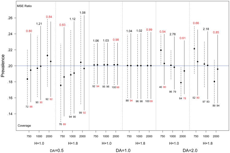
Fig 7.
Spread of central 95% of simulated prevalence estimates for population size 1000, with varying levels of homophily (H) and differential activity (DA). Solid lines represent prevalence estimates based on the posterior mean, dashed lines represent comparable estimates using the prior mean. Relative efficiency (MSE posterior/MSE prior) is given above each bar, and the coverage of nominal 95% confidence intervals is below each bar. The true prevalence is 0.2 (blue line).

