
Figure 3.
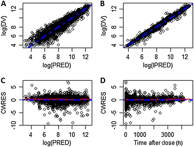
Goodness-of-fit plots for the final model. A) Observed vs. population predicted serum anrukinzumab concentrations on a log scale. B) Observed vs. individual predicted serum anrukinzumab concentrations on log scale. C) Conditional weighted residual vs. population predicted serum anrukinzumab concentrations. D) Conditional weighted residual vs. time after dose (h). The broken blue line represents the line of identity in panels A and B and the zero line in panels C and D. The broken red line represents a smooth curve fit of the data. DV, observed concentration; PRED, predicted concentration; IPRED, individual predicted concentration; CWRES, conditional weighted residual