
Fig 2.
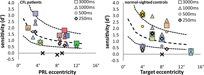
Left panel: CFL patient results, plotted as d' (signal-noise ratio) against estimated PRL eccentricity. Each color represents a different subject; different symbols are different presentation times as indicated in the legend. The X symbols are subjects who would not complete one block of trials (claiming to be unable to do the task), plus one patient (C11, the slightly negative d’ around 8°) who gamely completed 100 trials despite claiming not to know what the target looked like. The thick dashed line is a power function fitted to the data; the thin dashed lines are half and double the fitted line. Right panel: Normal control data, same conventions as for the CFL data. The lines are the same as in the first panel.