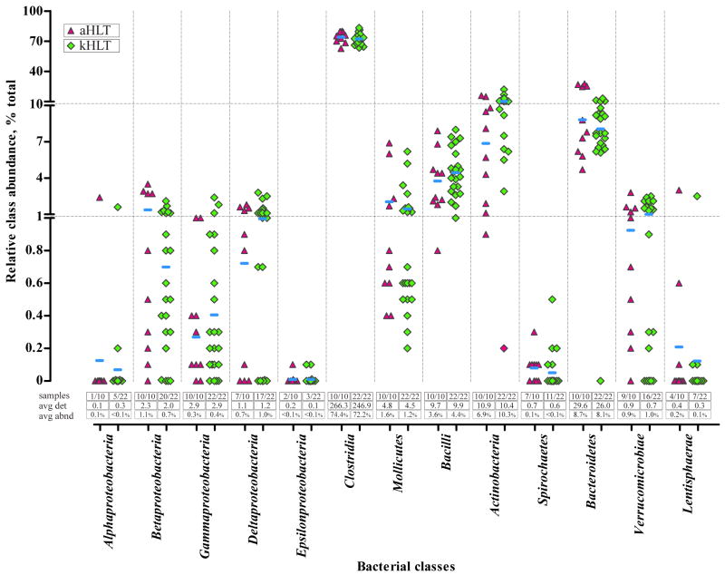
Figure 2. Distribution of microbial species detection and abundance among adolescent and adult samples.
The main figure displays a group scatter plot with the X axis listing different bacterial classes and the Y axis representing relative combined abundance of the members of each class in individual samples. Note that the Y axis is shown in linear scale separated into 3 segments. aHLT – healthy adult samples (triangle; n=10); kHLT – healthy adolescent samples (diamond; n=22). Horizontal bars represent weighted means of the abundance of each class among all samples of a particular group. Three sets of values below the scatter plot show (i) the number of samples in which members of each class were detected (“samples”); (ii) an average number of detected species of each class per sample (“avg det”); and (iii) an average combined relative abundance (weighted mean) of class members in each sample (“avg abnd”).

