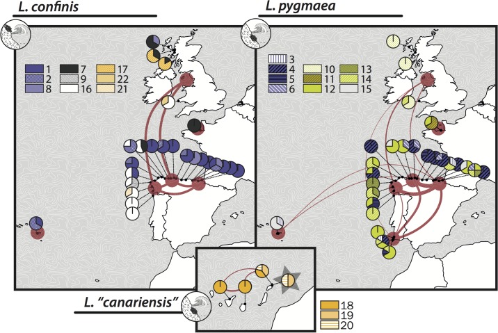
Fig 4. Map of geographic distribution of phycocyanin OTUs and haplotypes.
The pie charts show the proportion of each OTU per sampling locality. Color codes aim to reflect the presence of the main PC-IGS clades and are coherent with those of Fig 3. Haplotype connectivity between geographic regions is shown using a network. The width of the edges is proportional to the number of shared haplotypes, ranging from one to seven. The figure was generated with rworldmaps based on the public database Natural Earth (http://www.naturalearthdata.com)

