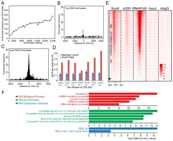
Figure 2. TSS-associated Class I Sox9 ChIP-seq peaks.
(A) Correlation of frequencies and peak calling scores at Class I Sox9 peaks. The X-axis represents consecutive bins of high (left) to low (right) peaks with 900 peaks per bin. The Y-axis plots the frequency of Class I Sox9 peaks within each of the binned peak sets.
(B and C) Mapping of top 2,000 ranked and bottom 2,000 ranked Sox9 peaks in relation to the nearest TSS. The X-axis represents distance from the peak center to the nearest TSS and, the Y-axis represents the frequency of Sox9 peak enrichment.
(D) Sox dimeric motif frequency in Sox9 peaks around the TSS. Sox9 peaks around TSSs (+/− 3.5 kb from TSSs) were grouped into bins of 1 kb, and the frequencies of Sox dimeric motifs per peak per kb were plotted.
(E) Signal intensity plots of ChIP-seq data for Sox9, p300, and RNA Pol II in promoter regions (+/− 2 kb from TSSs) compared to input and rabbit (rb) IgG controls in relation to expressions of their associated genes. Class I Sox9 peaks were ordered according to the expression level of the nearest associated gene (highest expression level at top). ChIP-seq signals for RNA Pol II and p300 were mapped to corresponding Sox9 peak regions.
(F) GREAT GO analysis of Class I Sox9 peaks.

