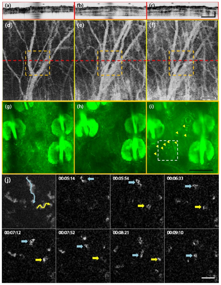
Fig. 4.
(a-c), (d-f) and (g-i) are images of the same location taken by structural OCT, angiographic OCT, and TPM, which show the progression of vasodilation, tissue swelling, and immune cell migration, respectively. From left to right they are displayed by increasing time: untreated (a, d, g), 1 h (b, e, h) and 2 h after LPS treatment. Dashed red lines in enface angiographic OCT images (a-c) indicate the cross sectional location of the structural OCT image (d-f) and dashed orange squares indicate the FOV of TPM images (g-i, Visualization 5 (8.6MB, MOV) , Visualization 6 (10.3MB, MOV) ). Yellow arrowheads in (i) point to the active immune cells. Figure 4(j) is a maximum intensity projection that displays the path taken by the immune cells in 4i followed by a time sequence of select neutrophil movement. The selected immune cells are marked by blue and yellow arrows. From top to bottom, the scale bars are 200, 200, 100, 50, and 20 μm, respectively.

