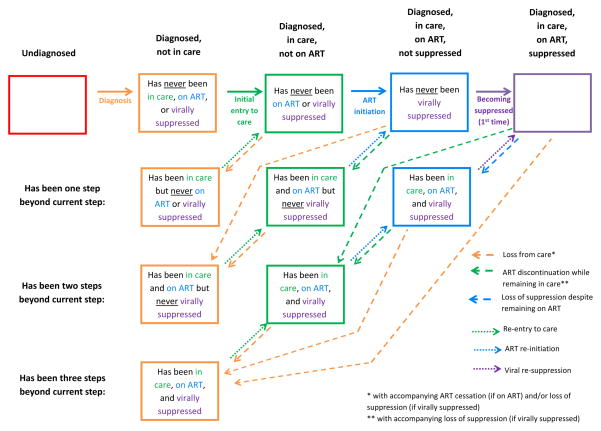
Figure 2. Proposed “HIV States and Transitions” Framework.
Boxes represent states and arrows represent transitions. Each of the five broad states (listed along top) is stratified into those who have never been beyond a given state (top row of boxes) and those who have been beyond but have returned to a prior state (2nd – 4th rows of boxes). Solid arrows represent the first instance of progression; dashed arrows represent return to a prior state; dotted arrows represent subsequent progression. Characterization of a population using this framework calls for tabular/spreadsheet compilation of: 1) numbers and/or proportions of HIV-infected persons in each state (box) at a given point in time; and 2) the rates at which each transition (arrow) occurs. The number (or proportion) of people in all boxes of a given color sum to the bar segment of that color in Figure 3. (For example, the numbers corresponding to the three green boxes in this figure sum to the entire “diagnosed, in care, not on ART” population represented by the green bar sub-sections in Figure 3.) Figure 2 depicts the system in a closed population; in reality, migration and death will provide additional entries into and exits from each state (see text), and the framework can be adapted to accommodate them. Also note that although the multiple dotted (or dashed) arrows of a given color are not differentiated here, they can be assigned different transition rates in practice.

