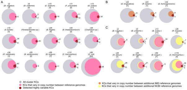
Figure 4. Comparison of highly variable KCs to known variation among reference genomes.
(A) In each Venn diagram, the gray circle represents the set of all KCs in a given genome cluster, the pink circle represents the fraction of those KCs exhibiting copy number variation across the cluster’s reference genomes, and the red circle represents the set of KCs detected as highly variable. Overlap of the pink and red circles indicates correspondence between known and detected variation. Each diagram is labeled with the cluster ID, representative species name, and number of reference genomes. (B–C) Additional variation in reference genomes that were not used as mapping targets is represented by either an orange circle (additional reference genomes from IMG) or a yellow circle (additional reference genomes from NCBI), compared to variation in included reference genomes (pink) and detected highly variable KCs (red). See also Figure S5.

