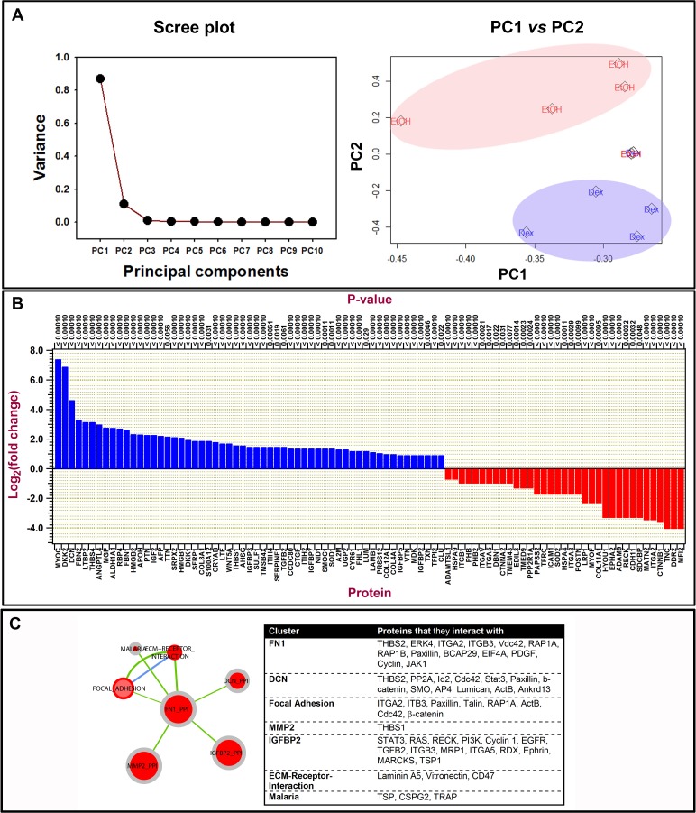
Figure 6.
Quantitative analysis of mass spectral data of over 5100 proteins identified from cell-derived extracellular matrices after DEX and control treatments. Proteins were identified by X! Tandem LC-MS/MS. Matrices were derived from five donor lines. (A) Principal component analysis plots: scree plot identifying the number of principal components that define the proportion of variance in data is illustrated. Plot of PC1 versus PC2 demonstrates data clustering for 4 of 5 donor lines. (B) Histogram illustrating log to the base 2-fold changes of ECM protein expression comparing DEX with control cultures. Proteins that were upregulated are in blue and those downregulated are in red comparing DEX with control cultures. (C) Protein–protein interaction clusters of those most abundantly enriched identified by KEGG pathway analysis of ECM proteins. In the pathway graph, the center part of the dot represents the enrichment of upregulated proteins and the outer layer of the dot corresponds to the enrichment of the downregulated proteins. Red center at the nodes indicates that protein set is enriched in proteins that are upregulated, gray indicates proteins that are not enriched in downregulated group. Green edge color indicates that there are overlapped proteins (similarity) between the two nodes connecting the upregulated proteins. Blue edge color indicates that there are overlapped proteins between the two nodes connecting the downregulated proteins. If a node is solid red, which means that this protein set is enriched in up- and downregulated protein. The Table lists the proteins that each cluster interacts with.

