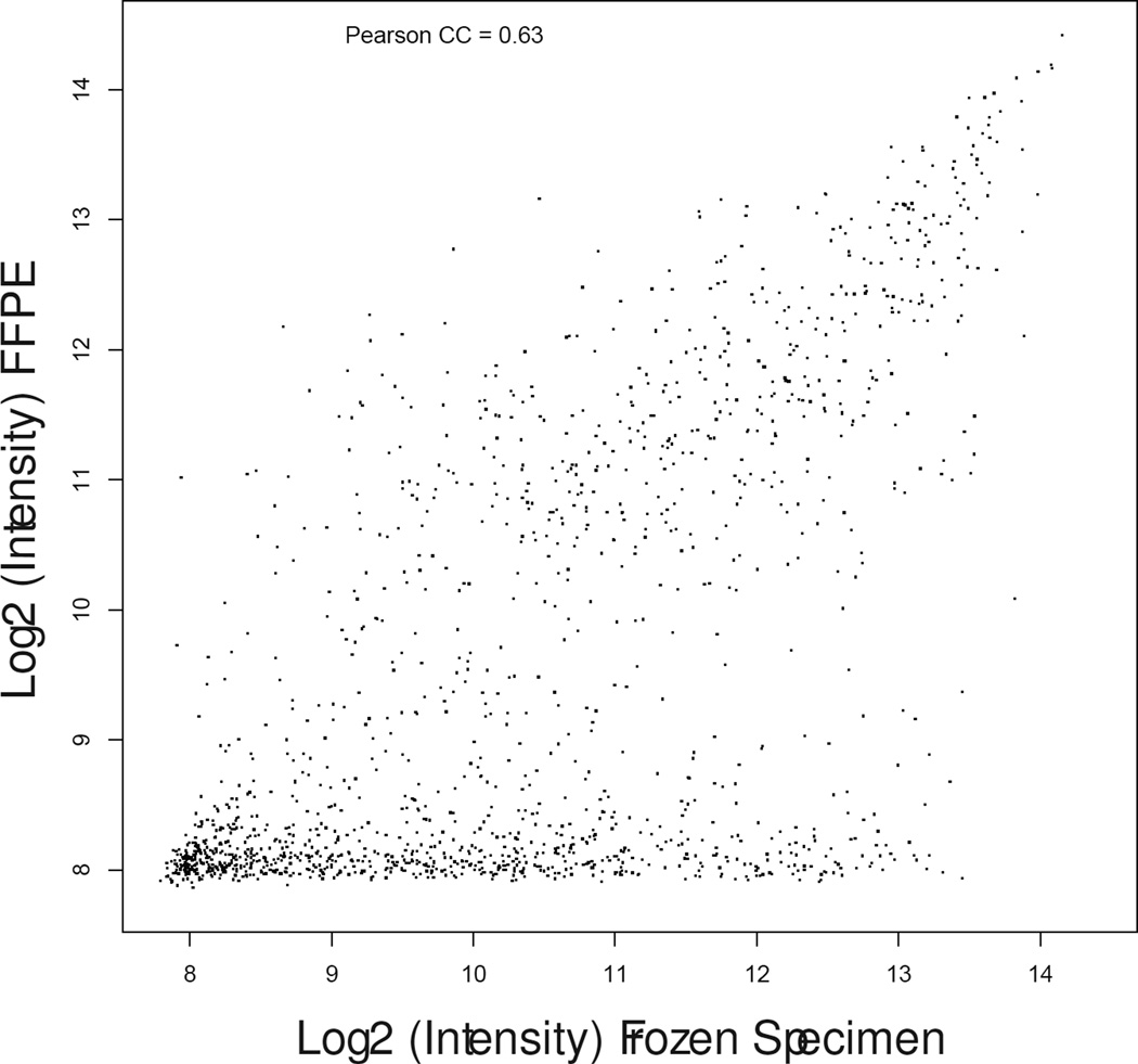
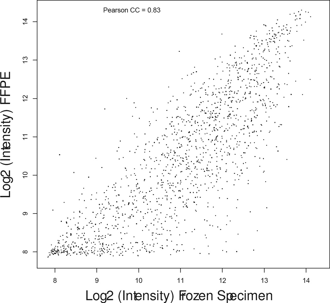
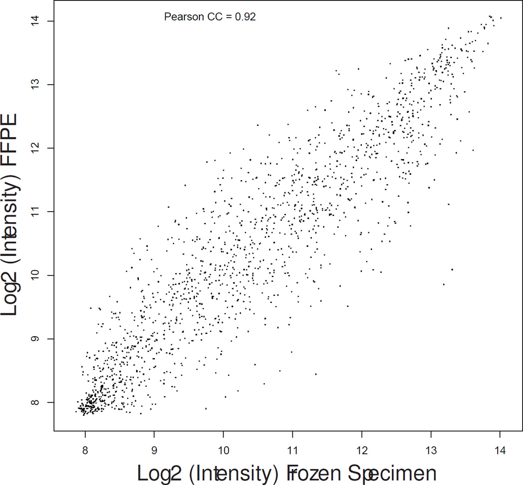
Figure 1.
Scatter plot graphs showing gene expression correlation between fresh-frozen (X-axis) and formalin fixed paraffin-embedded (Y-axis) specimens in patient matched samples #13-control (a), #17-treated (b) and #19-treated (c) representative of the lowest, median, and highest correlation coefficients.


