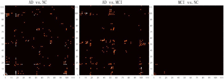
Figure 4.
Highlighted matrices showing Student t-test P maps for three diagnostic comparisons: left: AD vs. NC, middle: AD vs. MCI and right: MCI vs. NC are displayed. Each matrix is 113 × 113, corresponding to 113 ROI connectivity pattern. The ROIs are indexed from 1 to 113. Please refer to Zhan et al. (2013c) for corresponding numbers. Each cell of the GLM-adjusted network represents the connectivity, after removing the effects of age and sex at each element. The red points in these matrices highlight the location of uncorrected P < 0.001. Multiple comparisons were adjusted for by Bonferroni correction and the significance threshold was set to 7.9 × 10⁻⁶. The white points in these matrices highlight the location of the significant differences (after Bonferroni correction) in the network cell between the groups. The greatest number of connections were different when comparing controls and AD, but no connections survive Bonferroni correction when testing differences between controls and MCI.

