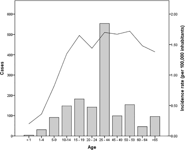
Fig 3. Cases and infection rates according to age.

The bars represent the number of cases for each age group that was registered during the decade. The solid line represents the incidence rate per 100,000 inhabitants).

The bars represent the number of cases for each age group that was registered during the decade. The solid line represents the incidence rate per 100,000 inhabitants).