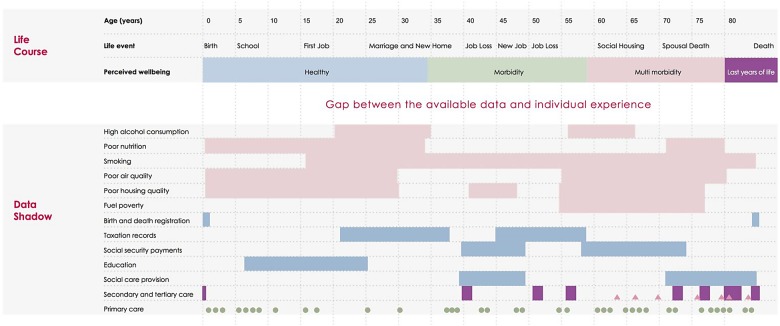
Figure 3.
Comparison between the individual experience and the data shadow: We map the life course of a hypothetical individual, showing age in 5-year increments, important personal events and their personal perception of health. In the first six rows of the ‘Data Shadow’ section we indicate behavioural and environmental factors that may be damaging to health, with periods of time of exposure illustrated with solid rectangles. In the following five sections we indicate governmental data sources that contain further information relevant to the health of the individual, with periods of data collection indicated by rectangles. The final three categories give a timeline of patient contact with care services (shown as a theograph47); this uses triangles, circles and lines to indicate different types of health care (primary, secondary and tertiary care) or social care provision. Small circles indicate a GP visit, rectangles a period in secondary, tertiary or social care and triangles an attendance at an emergency department.

