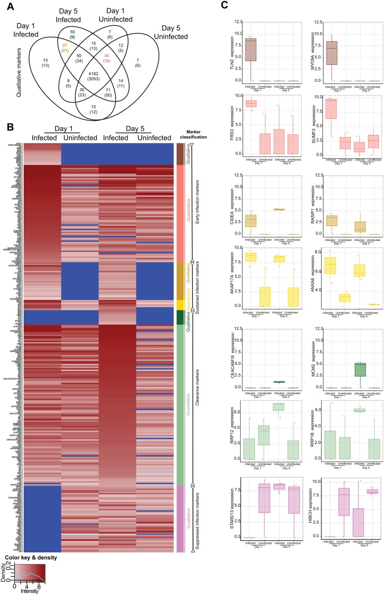
Fig 2. Proteome comparisons among conditions.
(Figure A) Venn diagram of the proteome showing the number of unique peptides detected according to each condition. The number in brackets refers to the number of unique identifiable proteins to which the peptides match in the database. Consideration according to presence/absence defined the qualitative markers, see also Table 1. (Figure B) Heatmap depicting the level of expression (absent in blue, lowest in light pink, and highest in burgundy according to the key at the bottom left) across conditions as demarcated at the upper part of the heatmap. Protein names, or peptide names if no match was found for a peptide, are shown to the left, where the symbols ‘<>‘ or ‘><‘ denote detection in the secreted or intracellular proteome, respectively. Colored bars at the right of the heatmap correspond to the classification into seven classes according to qualitative or quantitative criteria. (Figure C) Examples of peptides from each class (denoted by color) of marker are shown with the expression level according to the condition. Each replicate is denoted by a point, and boxes show the median (central line), IQR (outer box) and range (whiskers) in the expression level. The y-axis refers to the protein to which the peptide maps.

