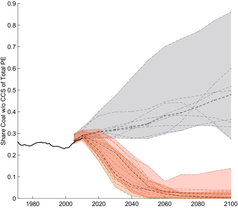
Fig. 8.
Share of coal in global primary energy use from 1971–2011 [historic data, based on ref. 30 and scenario data from 2005–2100 (36)]. Gray lines indicate the use of coal without CCS in business-as-usual scenarios, red lines show 500-ppm scenarios, and orange lines show 450-ppm scenarios. Black dashed lines indicate median values for different scenario categories.

