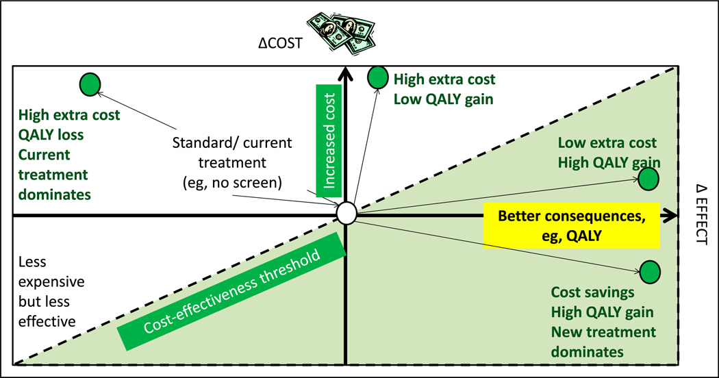
Figure 10.
Cost-effectiveness model or plane. Increasing cost is depicted on the y-axis and better effect or consequences (such as quality-adjusted life-years [QALY]) on the x-axis. The central point is the cost and effect of current (“standard”) management. The left upper quadrant represents more expensive and less effective alternative to the current intervention. The left lower quadrant represents less expensive but less effective intervention. The right upper quadrant shows 2 new interventions (green circles) with extra cost but better QALY gain. The right lower quadrant intervention provides high QALY with cost savings. The dotted line is referred to as the cost-effectiveness threshold.

