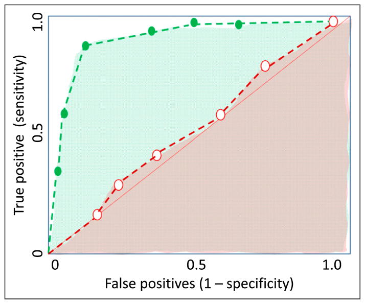
Figure 10.
Receiver operator characteristic (ROC) curves for a good test (shown with green dashed line) and a poor/ worthless test (shown with red dashed line). The area under the curve provides a measure of the capability of the test. The area under curve for the good test is shown with green dots and is close to 1.0. The area under the curve for the poor test is close to 0.5 (50% chance of diagnosing the disease) and is shown by a red shade.

