
Figure 17.
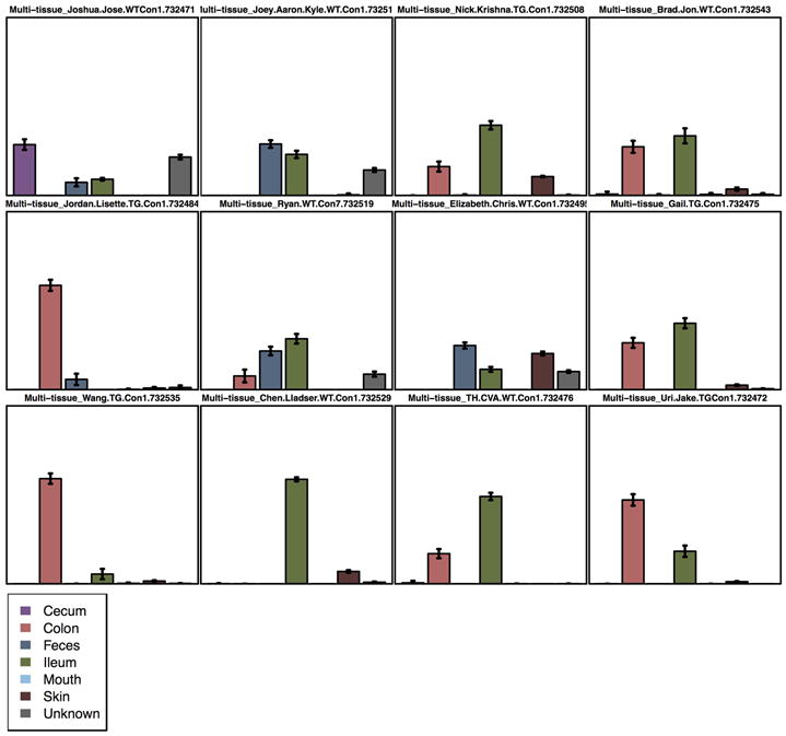
SourceTracker output showing a bar plot for each sink (mouse) present in the dataset. Each bar is a potential source (body site) and the height of each bar represents the percentage of taxa the source contributes to the taxa in the sink. The advantage of this visualization over the other two (area and pie chart) is that it shows error bars that allow to see the variance of the prediction.