
Figure 8.
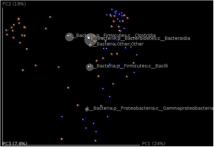
Biplot of the example data set. This is the unweighted Unifrac beta diversity plot, similar to Figure 7, with labels for the most 5 abundant phylum-level taxa added. The size of the sphere for each taxon is proportional to the mean relative abundance of that taxon across all samples. This plot is created by the command make_3d_plots.py -i $PWD/diversity_analysis/open_ref/bdiv_even7205/unweighted_unifrac_pc.txt -m $PWD/IQ_Bio_16sV4_L001_map.txt -t $PWD/diversity_analysis/open_ref/taxa_plots/table_mc7205_sorted_L3.txt --n_taxa_keep 5 -o $PWD/diversity_analysis/3d_biplot