Figure 8.
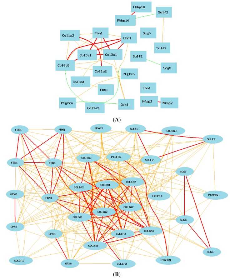
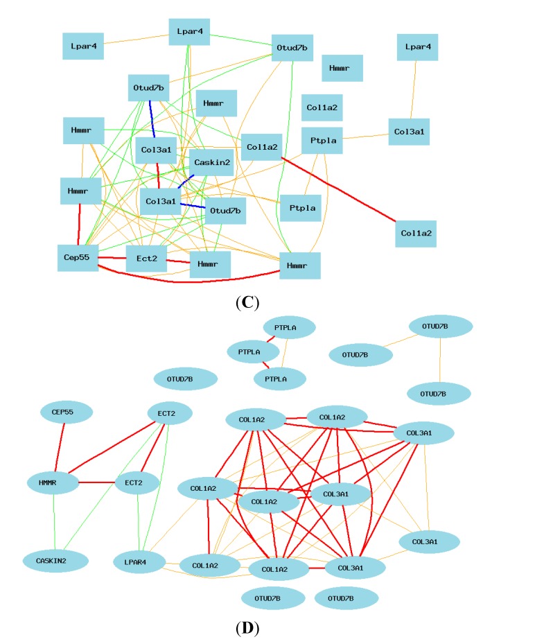
Summary of the gene networks of humans and mice. Each picture shows Pearson correlation coefficients greater than 0.5 or less than −0.5. The graph’s canvas is 40.0 by 40.0 cm, and the node labels are drawn with a 16.0 point font, and the edge labels are drawn with a 16.0 point font. Solid lines represent strong correlation (absolute value: thick line = 0.7–1; thin line = 0.5–0.7), while dashed lines present weak correlation (absolute value: 0–0.5). (A) Summary of the network of human-positive genes in mice. The 23 nodes in the graph below show the selected genes. The 30 edges between the nodes were filtered from the 253 total edges and drawn as curves; (B) Summary of the network of positive genes in human microarray data. The 33 nodes in the graph below show the selected genes. All nodes are displayed. The 288 edges between the nodes were filtered from the 528 total edges and drawn as curves. The graph’s canvas is 40.0 by 40.0 cm; (C) Summary of network of mouse genes: the 23 nodes in the graph below show the selected genes. The 66 edges between the nodes were filtered from the 253 total edges and drawn as curves; (D) Summary of gene network genes from mice in human microarray data. The 25 nodes in the graph below show the selected genes. The 55 edges between the nodes were filtered from the 300 total edges and drawn as curves.


