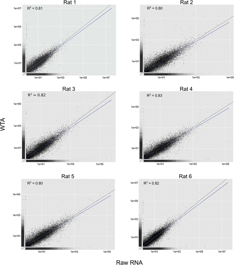
Figure 1.

Gene expression scatterplots. FPKM values for all transcripts were plotted, with each dot representing a single transcript. Solid blue lines show the best fit of the data and the dashed line identifies equal expression levels across both conditions.
