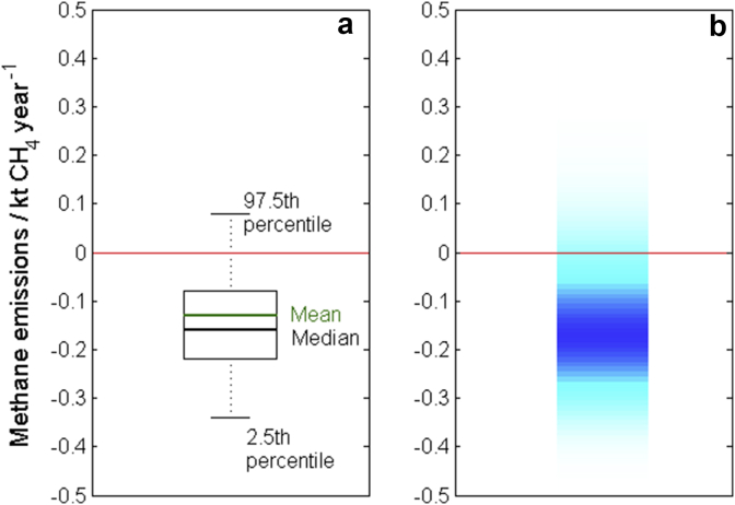
Fig. 10.
The trend in emissions of CH4 from agriculture in Wales between 1990 and 2010 shown using (a) a boxplot with the expected value (mean), median, 2.5th and 97.5th percentiles annotated on the graph and (b) a shaded array where the intensity of colour indicates the frequency of each observation with darker shading indicating a larger probability of observing that value. The expected value is −0.13 with 95% confidence interval given by [−0.34, 0.08]. The red lines mark the zero line. (For interpretation of the references to colour in this figure legend, the reader is referred to the web version of this article.).

