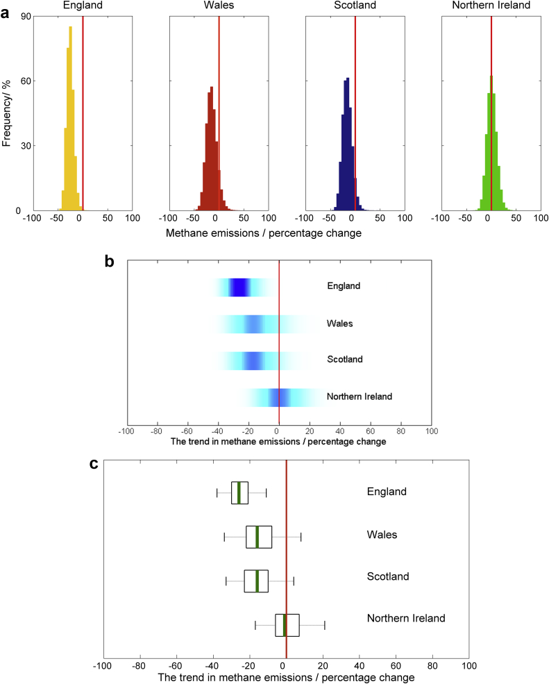
Fig. 3.
Scenario C: Assessing changes in methane emissions over time. The trend in emissions of CH4 from agriculture between 1990 and 2010, presented with (a) histograms, (b) shaded arrays, where the intensity of colour indicates the density of the underlying PDF, and (c) boxplots, where the green lines show the median values, the black boxes depicting the lower and upper quartiles and the dotted lines show the extent of the 95% confidence intervals. In each case the zero line is marked by the solid red line. (For interpretation of the references to colour in this figure legend, the reader is referred to the web version of this article.).

