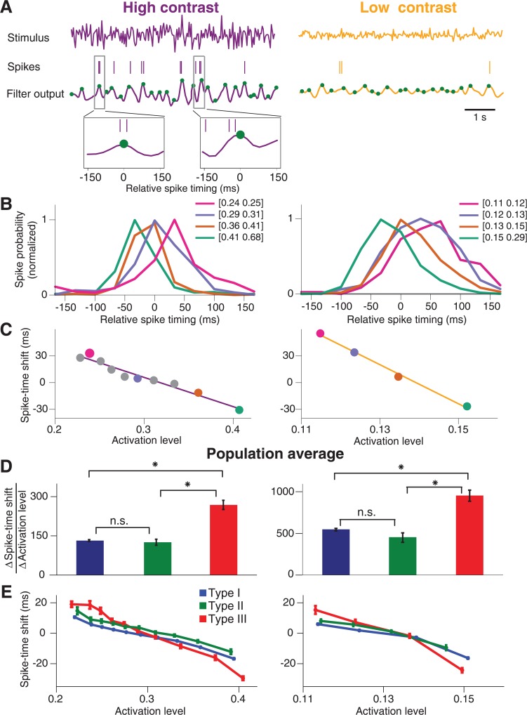
Fig 7. Estimation of spike-timing dynamics.
(A) Stimulus segments of high contrast (left) and low contrast (right) and corresponding spike trains of a sample ganglion cell (here Type III). The cell’s filter output, obtained by convolving the stimuli with the cell’s corresponding STAs, is shown below. Local maxima are marked by green dots. Two segments of the filter output trace and corresponding spikes are shown enlarged to illustrate the collection of relative spike times in a window around local maxima. (B) Histograms of relative spike timing for peak values of the filter output in four different ranges. The boundaries of these ranges are specified in the legend. Histograms are normalized to their peak values. Note that the negative values of relative spike timing do not imply acausal effects. Rather, the computation of the activation level by filtering the stimulus with the STA includes an average delay between the relevant stimulus and the elicited spikes, in the range of around 100 ms (see, for example, the STA peak times in Fig 1B). The relative spike timing observed here can thus be viewed as a correction to this average delay. (C) The characteristic spike-time shift, computed as the location of the maximum of the relative spike-timing histogram, plotted versus the mean filter output peak size in each applied filter output range. The characteristic spike-time shifts become more negative with increasing filter output peak size, showing that stronger activation leads to relatively earlier spikes. The data points corresponding to the histograms depicted in (B) are marked by dots in the respective colors. Solid lines display linear fits to the data. (D) Population averages of the absolute values of the slopes (∆Spike-time shift/∆Activation level) obtained from the linear fits as illustrated in (C) for Type I (blue), Type II (green), and Type III (red) cells. Error bars denote standard errors. Differences between the populations are marked as significant (t-test at 5% significance level, Bonferroni corrected) by asterisks and otherwise by “n.s.” (E) Population average of the curves shown in (C) for Type I (blue), Type II (green), and Type III (red) cells. Error bars denote standard errors. The plot shows that Type III cells span a much larger range of delays than the other two types.

