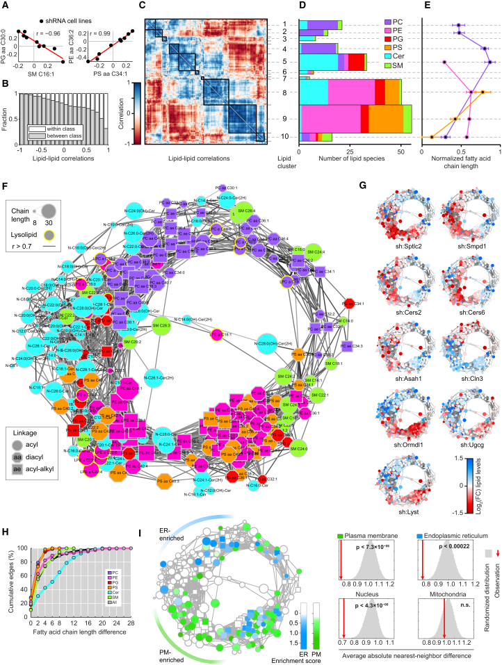
Figure 3.
Analysis of Lipid Abundance Reveals the Circular Organization of the Lipid Coregulatory Network
(A) Scatter plots show example pairs of lipids whose relative abundance over the nine perturbations is negatively (left panel) or positively (right panel) correlated. Red lines indicate linear fit. Data are combined of three independent experiments and shown as mean.
(B) Analysis of the fraction of correlations that link lipids of the same lipid class (white) or different lipid classes (gray), as function of correlation strength. Data are combined of three independent experiments and shown as mean.
(C) Hierarchical clustering of the lipid-lipid correlation matrix. Rows and columns correspond to the 245 measured lipid species. Black boxes indicate clusters of strongly positively correlated lipids. Lipid cluster numbers indicated on the right. Data are combined of three independent experiments and shown as mean.
(D) Analysis of the number of lipids in each cluster per lipid class. Width of the bars is scaled to match (C). Data are combined of three independent experiments and shown as mean.
(E) Normalized fatty acid chain lengths for selected clusters and lipid classes. Lipid classes are colored as in (D). Chain length is normalized from the shortest to the longest fatty acid side chain per class. Data are combined of three independent experiments and shown as mean. Values are mean ± SEM.
(F) Network visualization of the positive lipid-lipid correlations. Edges are correlations of r ≥ 0.7. Nodes are lipids. Node shape, size, and outline represent fatty acid bonds, chain length, and lysolipids, respectively (see legends). Data are combined of three independent experiments and shown as mean.
(G) Nodes of the network are color-coded based on the fold-change of relative lipid abundance for each of the nine shRNA cell lines as indicated in legend. Data are combined of three independent experiments and shown as mean.
(H) Cumulative percentage of lipid coregulation as a function of the maximum fatty acid chain length difference per lipid class and for all (see legend). Data are combined of three independent experiments and shown as mean.
(I) Left: network visualization of lipid enrichment in either ER (blue) or plasma membrane (PM, green) subcellular fractions. White nodes depict not enriched or not measured lipids. Right: significance of the clustering on the circular network for the enrichment in four subcellular fractions. Red lines indicate the average absolute difference between enrichment scores of direct neighbors in the network, gray areas indicate the distribution of randomized repeats. NS, not significant. Subcellular fraction data are from http://lipidmaps.org combined of three independent experiments and shown as mean.
See also Figure S3.

