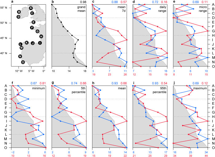
Figure 1. Patterns of temperature metrics across the European Atlantic intertidal ecosystem.
(a) Locations surveyed. Geographic pattern of metrics: (b) grand mean, (c) 7 day mean, (d) daily range, (e) microhabitat range, (f) minimum, (g) 5th percentile, (h) mean, (i) 95th percentile, (j) maximum. Black line (b) is grand mean, calculated using all data from each shore. Red and blue lines (c–j) calculated using the warmest and coldest 30 days of each year (7 days for (c)), per shore. The shaded area is the pattern expected if each metric was perfectly correlated with latitude. Points in shaded area are “cooler than expected given latitude”, and points outside shaded area are “hotter than expected”. Correlation coefficients between each metric and latitude are depicted in the top right corner of each panel (blue for cold and red for warm periods). Map created in R35 using Global Self-consistent, Hierarchical, High-resolution Geography Database (GSHHG) coastline data.

