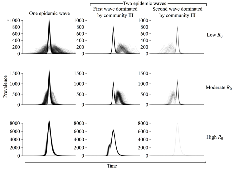
Figure 4.
Taxonomy of epidemic curves. For each R0, 1000 simulated epidemics were classified as either single-wave (left), multiwave starting with a community III wave followed by a community I and II wave (middle), or multiwave ending in a community III wave (right). At R0=2.4, 554 of 1000 (55.40%) had a single wave and 446 of 1000 (44.60%) had 2 waves; of the 446 with 2 waves, community III dominated the first wave in 392 (87.89%). At R0=1.9 and R0=7.5, only 22.20% (222/1000) and 20.60% (206/1000) of epidemics exhibited 2 waves, respectively. Time series are superimposed so that the peaks of the largest waves align.

