
Fig. 31.
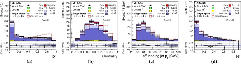
Single-lepton channel: post-fit comparison of data and prediction for the four top-ranked input variables in region. The plots include a D1, b , c , and d H1. The first and last bins in all figures contain the underflow and overflow, respectively. The bottom panel displays the ratio of data to the total prediction. An arrow indicates that the point is off-scale. The hashed area represents the uncertainty on the background. The dashed line shows signal distribution normalised to background yield. The signal yield (solid) is normalised to the fitted