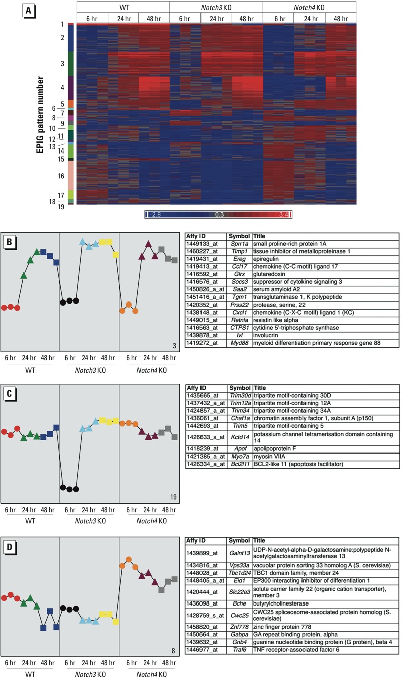
Figure 5.

Pattern analysis of transcript expression using EPIG (extracting microarray gene expression patterns and identifying coexpressed genes)–identified candidate genes. KO, knockout. (A) Heat map of 1,723 transcripts that fit in 19 patterns (labeled numerically) identified by EPIG (see Supplemental Material, Table S4, for full list of genes in all patterns). Red and blue colors correspond to up‑ and down-regulated genes, respectively. Transcripts are colored by fold change relative to respective air controls. (B) Pattern 3 represents transcripts that increased after 24 (triangles) or 48 (squares) hr ozone exposure in all genotypes (232 transcripts; top 14 most significant are shown on right). (C) Pattern 19 represents transcripts that decreased after 6 hr (circles) ozone only in Notch3–/– mice (12 transcripts, top 9 shown on right). (D) Pattern 8 represents transcripts that change only in Notch4–/– mice. These transcripts increased after ozone at all time points (50 transcripts, top 11 shown on right). In (B–D), the colors of symbolsrepresent the nine groups of samples, and profiles represent the average of the top 6 gene probe set profiles within the respective pattern. The y‑axes indicate the changes in gene expression (log2 intensity) relative to air-exposed controls.
