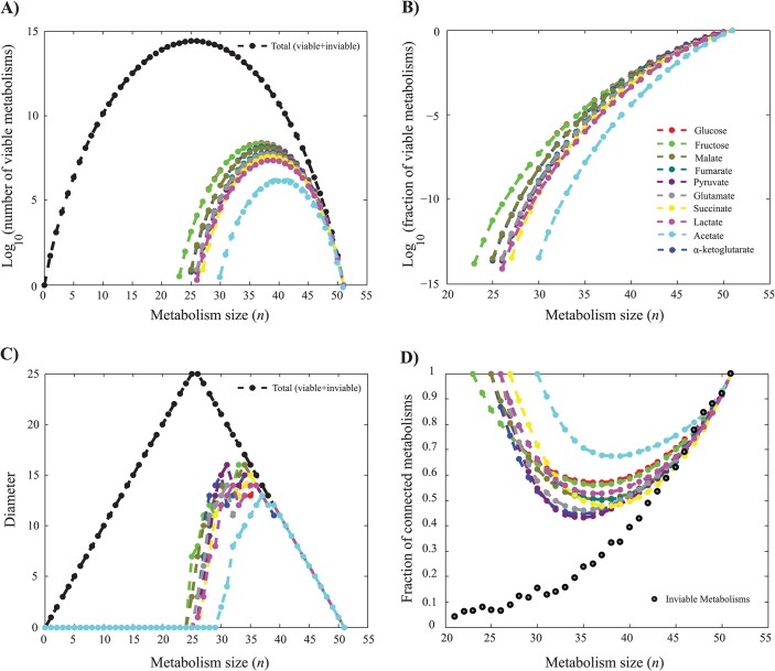
Fig 1. Metabolisms viable on different carbon sources and genotypic differences among them.
a) Number of viable metabolisms. Black circles (vertical axis) indicate the total possible numbers of metabolisms of a given size n (horizontal axis, N = 51, 0 ≤ n ≤ 51). Colored data points indicate the number of metabolisms viable on the single carbon sources indicated in the legend. b) Fraction of metabolisms viable on different carbon sources. Note the logarithmic vertical scale. Data on glucose in a) and b) has been previously published [19]. c) Genotype network diameter. Black circles indicate the diameter of genotype space for metabolisms of a given size, which is an upper bound to the diameter of any one genotype network. Colored data points indicate genotype network diameter for metabolisms viable on a single carbon source. Where sets of viable metabolisms comprised more than one connected component, the diameter of the giant component was chosen. At n ≥ 40, all genotype networks have the maximally possible diameter. d). Fraction of metabolisms that contain no disconnected reactions. Colored circles correspond to metabolisms viable on the carbon source specified in the legend and black circles correspond to inviable metabolisms. Data on inviable metabolisms is based on 10000 randomly sampled inviable metabolisms. Interpolation between data points (circles) is linear and displayed as a visual guide.

