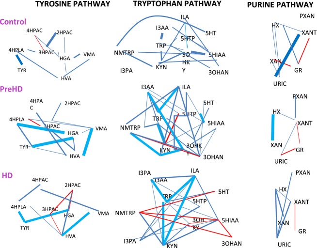
Figure 4.
Network graph representing Pearson correlations between metabolites for NC, PHD, and HD groups (r = ±0.7 to ±0.2) for each pathway. Red lines represent negative correlations while blue lines represent positive correlations. These results demonstrate altered relationships amongst metabolites across disease groups, suggesting unique alterations in the feedback control of key enzymatic processes that change with HD progression.

