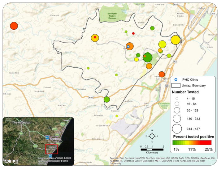
Figure 1. Geospatial distribution and HIV prevalence of mobile testing sites.
The grey line delineates the Umlazi Township boundary. The size of the circles show the number of patients tested at the specific mobile sites and the color of the circles illustrate the HIV prevalence at the sites during the study period. Green represents lowest prevalence, red is highest prevalence. Isipingo is not included in this map.
IPHC: iThembalabantu “the People’s Hope” Clinic

