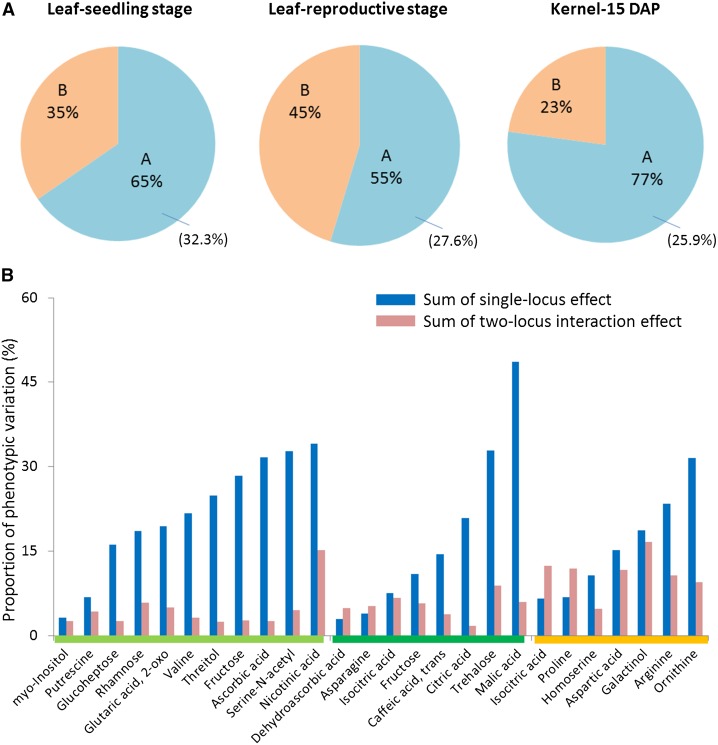
Figure 2.
Schematic Summary of QTL Identification in This Study.
(A) Pie chart showing the proportions of metabolites that have different numbers of QTL. “A” represents the proportion of metabolites that have more than one QTL; “B” represents the proportion of metabolites that have only one QTL; number in the parenthesis represents the proportion of metabolites in “A” for which significant epistatic interactions were detected.
(B) Proportion of phenotypic variation explained by all the single QTLs and epistatic interactions. The bars above the metabolite names represent different tissue types: light green, leaf at seedling stage; dark green, leaf at reproductive stage; orange, kernel.

