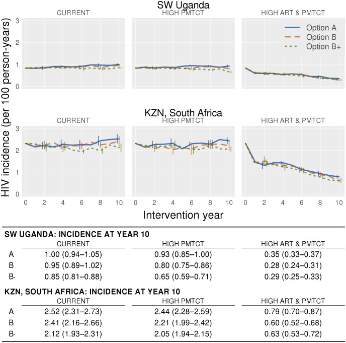
Fig 2. Annual incidence rates averaged over ten simulations for the ten-year intervention period in Uganda (top row) and South Africa (bottom row).
Each graph shows all three PMTCT interventions; the first, second and third columns represent Current, High PMTCT and High ART and PMTCT coverage respectively. The error bars show 95% confidence intervals. The table below shows the mean incidence rate in the tenth year of the intervention, 95% confidence intervals are in the parentheses.

