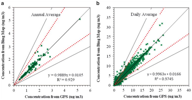
Figure 4.

Scatterplots contrasting annual average (left) and 24-h maximum (right) PM2.5 concentrations using GPS and automated geocoding home locations. Concentrations predicted using RLINE dispersion model and 2010 Detroit meteorology. Plots show 160 homes; dashed red lines indicate a factor of 1.5 agreement; black lines indicate a factor of 2 agreement.
