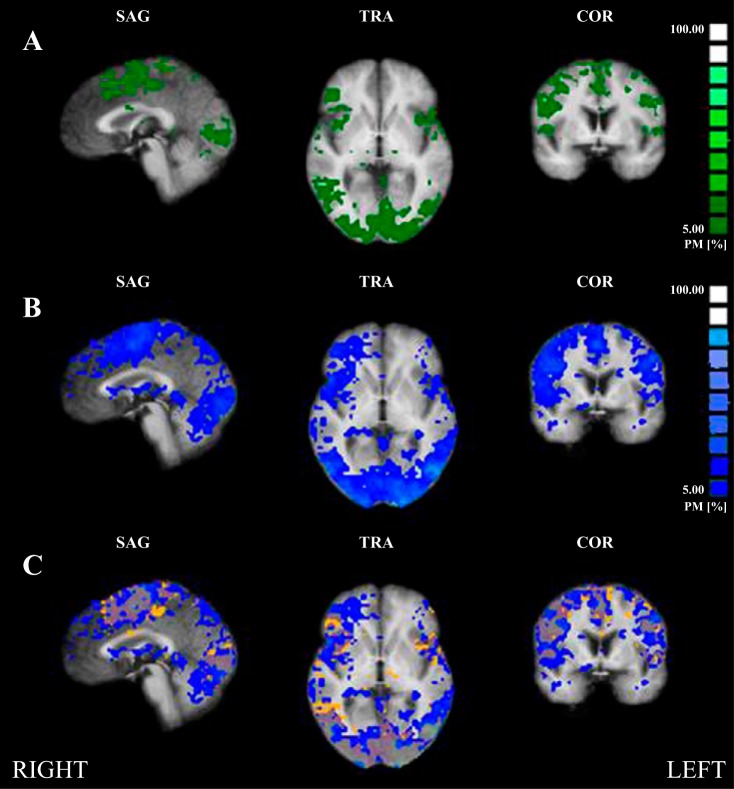
Fig. 6.
Probability mapping. A: control subjects (green), 0% minimum threshold. B: coronary artery disease patients (CAD; blue), 5% minimum threshold. Each colored cluster represents the relative percentage of subjects leading to significant task activity during a 40% maximal voluntary contraction (MVC) handgrip task based on the bar graph at right. C: probability map overlap of both groups. Control, orange; CAD, blue (voxel threshold = 15 voxels; 0% minimum threshold). CAD patients (blue) had much greater variability in activation responses than control, who indicated greater anatomical consistency.

