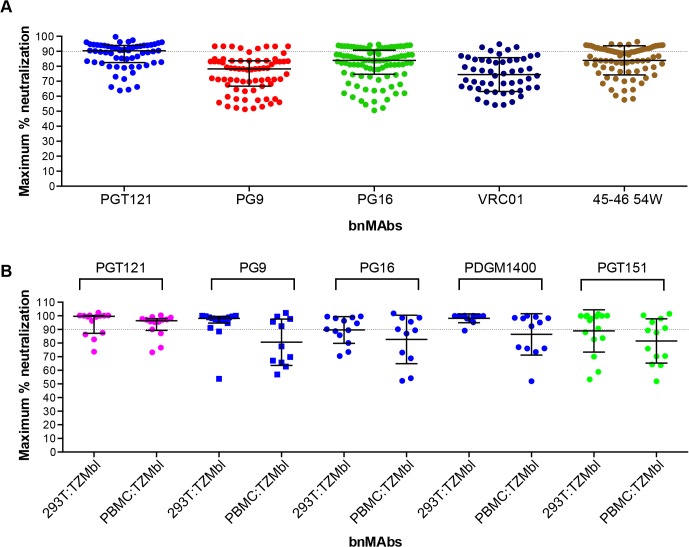
Fig 4. Maximum neutralization activity of bnMAbs in PBMC assays.
(A) Each point on the graph represents the percent at which the neutralization curve plateaued for a single PBMC-grown clade B virus assayed in PBMC cells. The dotted line designates 90%. (B) Each point on the graph represents the percent at which the neutralization curve plateaued for a single molecular clone virus against the bnMAbs listed above the data points. Virus clones were produced in both 293T cells and PBMCs as indicated on the x-axis. The data points are colored according to which site the bnMAb targets: high-mannose patch (magenta), CD4bs (red), V2 apex (blue), gp41-gp120 interface (green). The bars represent the medians and the whiskered bars represent the interquartile range.

