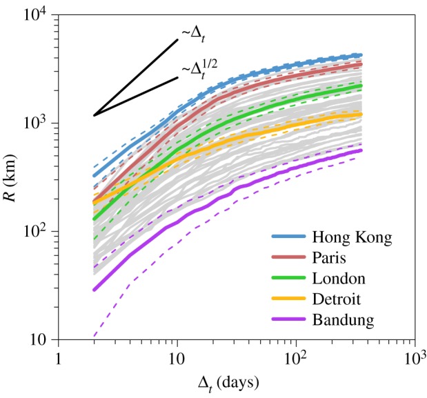
Figure 3.

Evolution of the average radius. Each curve represents the evolution of the average radius R averaged over 100 independent extractions of a set of u = 300 users as a function of the number of days Δt since the first passage in the city. In order to show the general trend, each grey curve corresponds to a city. The evolution of the radius for several cities is highlighted, such as the top and bottom rankers or representatives of the two main detected behaviours. Curves with a linear and square root growth are also shown as a guide for the eye. The dashed lines represent the standard deviation.
